[BRAND DESIGN]
Apex Nomz
A jerky brand built on one joke, that the beef was abducted, and a system that tells it everywhere.
Role
Brand Designer
Year
2024
Services
Brand Design, Package Design, Logo Design

[ The short version ]
Problem
Jerky shelves are a wall of brown bags and cowboy type. Nothing sticks by the time you reach the register.
What I did
Built the identity around a single image, a UFO beaming up a cow. Then a slab-serif wordmark, one color per flavor, and a deadpan voice that runs from pouch to billboard.
Outcome
One illustration, one wordmark and one mono typeface carry the brand across pouch, box, sign, billboard and merch.
01 / The pouch
One color per flavor.
The kraft-and-clear pouch lets the jerky sell itself. The top band changes by flavor (green for Original, yellow for Honey Bourbon). The layout and the abduction scene stay the same. Protein and weight sit in the beam, where the eye already goes.

02 / Signage
Crop the cow, keep the brand.
On the storefront sign, the cow wanders in from the edge under the wordmark. Even half a cow still reads as Apex Nomz.

03 / Out in the world
Say it with a straight face.
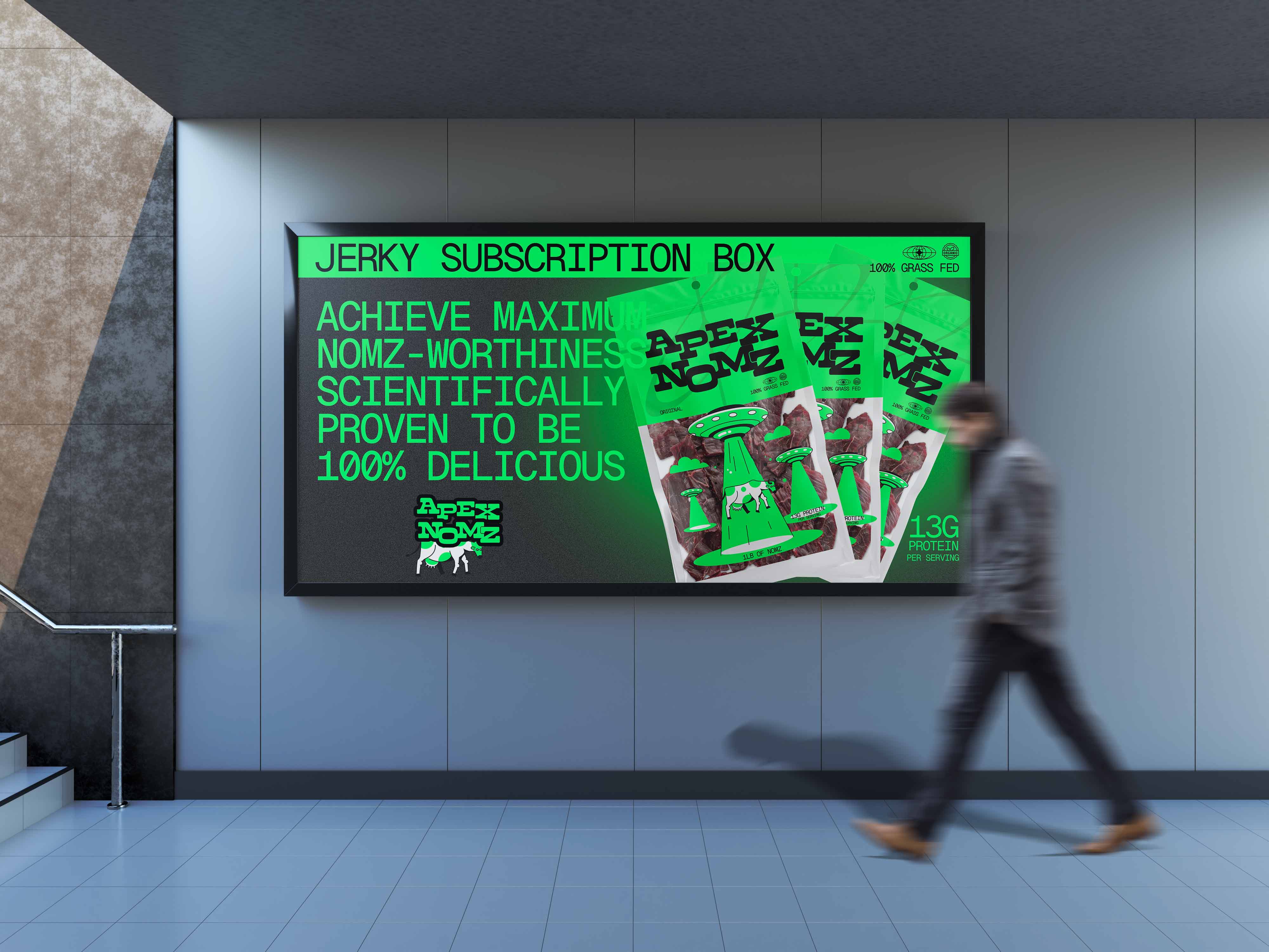
The billboard promises jerky “scientifically proven to be 100% delicious,” set in the same mono type as the packaging. The copy stays deadpan so the illustration can be loud.
04 / Merch
It wraps around anything.
Ship, beam, cow and clouds work as separate pieces, so the scene rearranges to fit a curved bottle without new artwork.

[ Results ]
1
Illustration across every touchpoint
5
Formats: pouch, box, sign, billboard, merch
1
Color per flavor
[ SAY HELLO ]
© 2026 ANDY RAMOS · CHARLOTTE, NC