[PRODUCT DESIGN]
Globe Trek
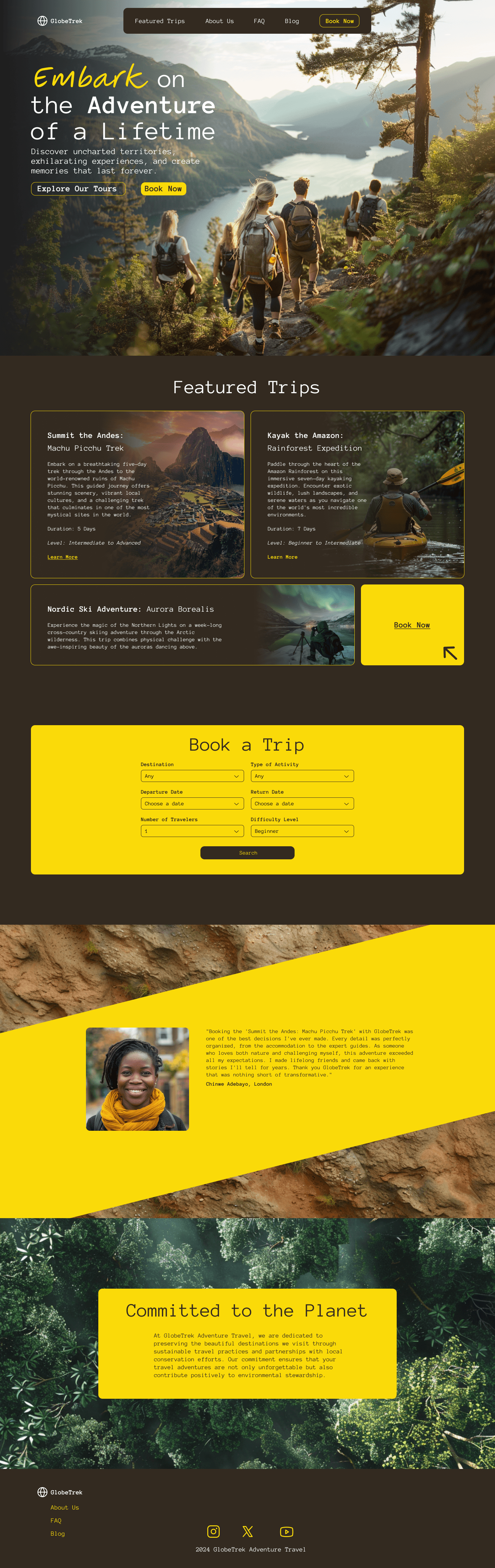
A concept site for an adventure travel agency where the photography sells the trip and the layout gets you booked.
Role
UX/UI Designer
Year
2024
Platform
Responsive Web
Services
UX/UI Design (concept)

[ The short version ]
Problem
Travel sites tend to pick one: great photography with the trip details buried, or a booking engine with no pull. I wanted to see if one homepage could do both.
What I did
Designed a responsive site in two colors. Every trip card shows duration and difficulty up front, and a six-field booking search sits right on the homepage.
Outcome
A homepage that goes from “I want that” to a search in one scroll.
01 / The system
Two colors, one rule.
Forest brown is the ground. Signal yellow marks anything you can act on: buttons, the booking panel, the testimonial band. A monospace face makes trip details read like a field log, and “Embark” is the only script word on the site.
02 / Responsive
Planned on the couch, checked on the trail.
Every page adapts from desktop to phone, so trip details stay readable wherever people are planning.

[ Next project ]
Apex Nomz

[ SAY HELLO ]
© 2026 ANDY RAMOS · CHARLOTTE, NC